The Art of Color: A Deep Dive into Color Theory for Artists
When you can speak the language of color, it's like you've got a secret code to share ideas without even saying a word. In this blog, I will go over some basic color theory and share a few examples of how I’ve used color in my murals to create different stories. Scroll down for practical tips that I really use in my designs!
The Basics: What is Color Theory?
I know this is literally kindergarten stuff, but it’s really helpful to brush up on basics before we go deeper. Color theory is the study of how colors interact with each other. At its most basic level, color theory involves the color wheel, a visual representation of the relationships between colors.
The Color Wheel is divided into three categories:
Primary Colors: Red, blue, and yellow are the primary colors. These are pure colors that cannot be created by mixing other colors.
Secondary Colors: Green, orange, and purple are secondary colors. These are created by mixing two primary colors together.
Tertiary Colors: These are made by mixing a primary color with a secondary color. Examples include red-orange, yellow-green, and blue-purple.
Color Harmonies: Creating Visual Balance
Color harmony refers to the pleasing arrangement of colors that creates a sense of order and balance in an artwork. There are several types of color harmonies that artists can use to evoke different moods and atmospheres.
Monochromatic: This color scheme uses variations in lightness and saturation of a single color. Monochromatic schemes are simple and elegant, creating a cohesive look that’s easy on the eyes. They’re particularly effective in conveying mood through subtle shifts in tone.
Analogous: Analogous color schemes use colors that are next to each other on the color wheel. These schemes are often found in nature and are pleasing to the eye because they create a sense of harmony and comfort. For example, a palette of blue, blue-green, and green can create a serene, calming effect.
Complementary: Complementary colors are opposite each other on the color wheel. When used together, they create high contrast and vibrant looks that can make an image pop. This scheme can be visually striking, but it must be used carefully to avoid overwhelming the viewer.
Split-Complementary: This scheme is a variation of the complementary color scheme. It uses a base color and two adjacent colors to its complementary color. This allows for high contrast while reducing the potential for tension or visual discord.
Triadic: A triadic color scheme uses three colors that are evenly spaced around the color wheel. This scheme offers a balanced and vibrant look, giving the artwork a sense of richness and diversity without overwhelming the viewer.
Tetradic (Double-Complementary): This color scheme uses four colors that are arranged into two complementary color pairs. It offers plenty of possibilities for color variation while maintaining a cohesive look. However, balancing these colors can be challenging, as they can easily clash if not used thoughtfully.
Practical Tips for Applying Color Theory
It’s really helpful to chose a defined color palette when you start designing your mural, especially if you’re new to mural painting.
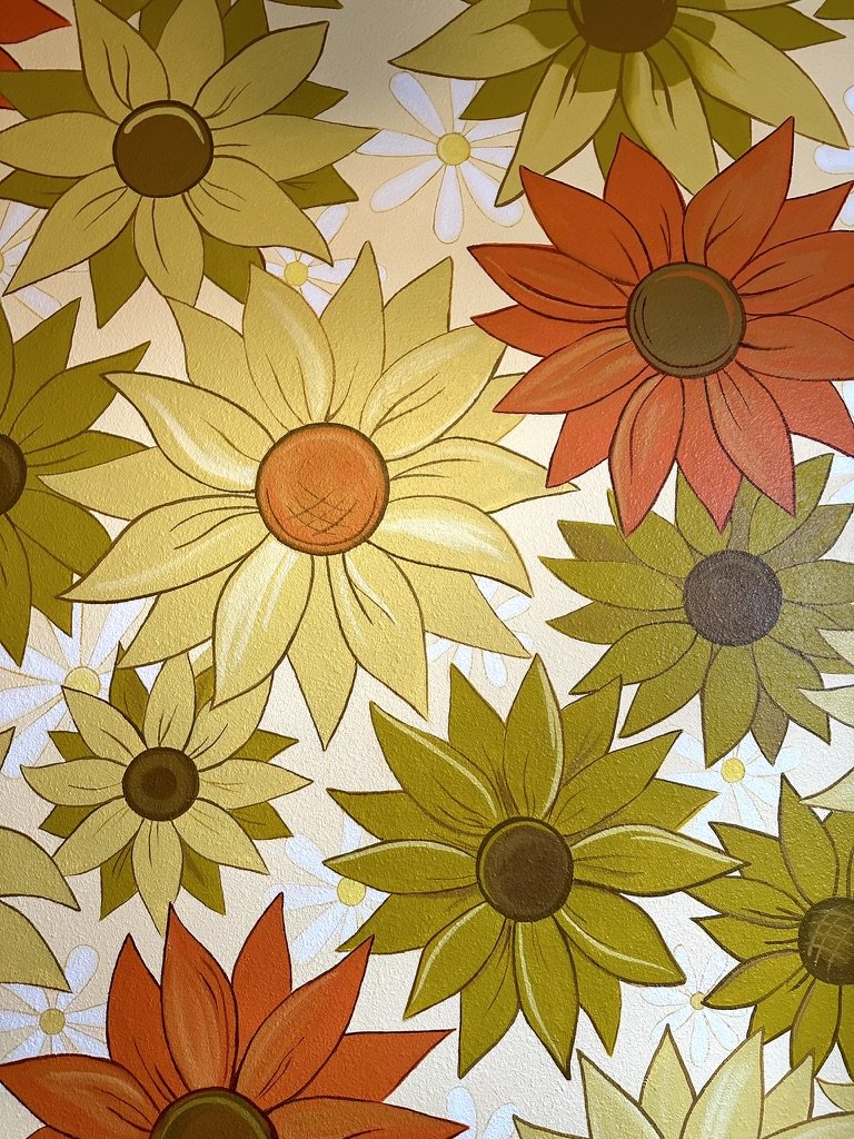
Start with a Limited Palette: Try working with a limited palette of just 3 colors. This has several added benefits: You will not have to buy as much paint, your mural look more intentional, and a limited palette will help you focus in on creating the best design possible without extraneous detail. I often notice beginner muralists want to throw every color at the wall, which can look jumbled. In my flower mural on the right I intentionally limited my color palette.
Experiment with Color Harmonies: If you use digital art, try swapping your colors for different color harmonies -monochromatic, analogous, complementary, etc.
Pay Attention to Value: Even if your colors are harmonious, your artwork can fall flat if the values are too similar. Squint your eyes or change the artwork to greyscale. Make sure to have a range of values to create contrast if the values are too similar.
Consider the Context: This is the most important part! Think about where your artwork will be displayed. I always strive for my murals to be site-specific. The surrounding environment can influence how your colors are perceived, so consider the context in which your work will be viewed. For example, I painted a very vibrant and busy school mural (above on right.) In order to make the mural less distracting I incorporated the school building’s main green color into the mural’s design to make it feel cohesive to the space. I also made the mural primarily blue and green in order to soften the otherwise busy design. I added the complementary colors orange/brown sparingly just to make the blue appear more vibrant.
Conclusion: The Endless Possibilities of Color
By understanding the fundamentals of color harmonies—such as complementary, analogous, and triadic color schemes—you can make informed decisions that enhance your mural and how it fits in its environment.
Experimentation is key. The more you practice mixing colors, the more you understand their nuances and the messages they convey. If you use procreate or photoshop, it’s easier to try out different color possibilities. With experimentation, you'll find it easier to convey storytelling in your art. This will make your work resonate more with the people who see it.- but it is important to remember that every culture carries different associations with color!
Ultimately, engaging with color theory is not just about mastering a skill—it's about deepening your understanding of visual storytelling. Embrace the process, and let your creativity flourish through the vibrant language of color.
The light green incorporated in this mural can be found all over the school’s buildings. This subtle use of color helps create a harmonious effect between the mural and its surroundings
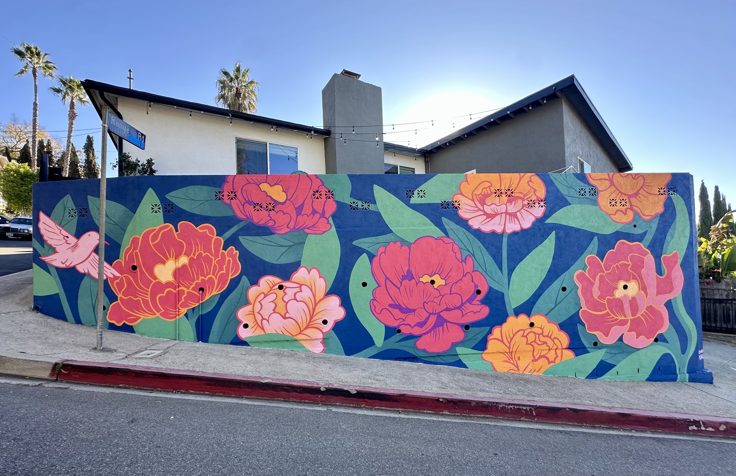
My client wanted a very vibrant mural. So instead of making the art harmonious to the environment (as in the above school mural) my goal was to make the artwork leap off the wall. I achieved this by using a nearly double complementary scheme as well as warm colors on top of cool colors to enhance the colors popping off: pinks over greens (near complements) and oranges over blues (complementary.) I mixed my greens using the deep background blue to make the artwork feel more unified.
Here is an example of how competing neon colors can fight for dominance. This can be a benefit for your art if you are trying to convey tension or vibrancy. But if not properly considered, too many bright colors won’t look like an intentional design. The easiest way to incorporate a rainbow of colors in a design is by including a lot of white or negative space.


